QUIKSILVER REBRAND
2022 | Rebrand Project
PROJECT OBJECTIVE
Quiksilver is known for their iNFLuence on the surfing industry. The objective was to rebrand their visual identity to FIt their new expectations towards an expanding demographic. This was done by reconstructing an outdated logo and brand identity System into a modern, peaceful and mature approach ALL while highlighting the expansion of their ski and snowboard collection.
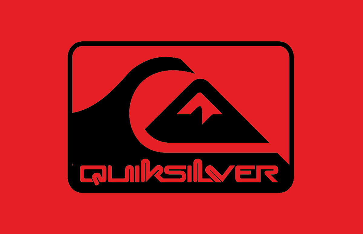
CURRENT LOGO
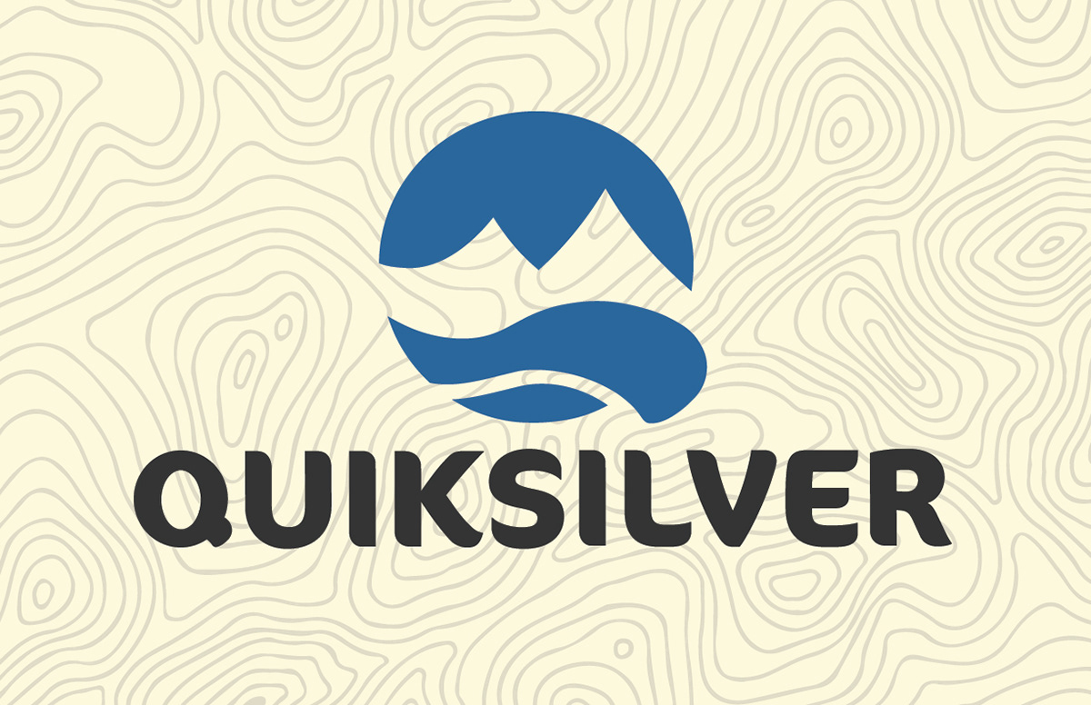
ReBRANDED LOGO
PROBLEM
Quiksilver’s audience is focused towards 25-34 year old age group that results in 30.49% of their customers. They also neglect their ski and snowboard collection due to dominance of the surf-wear market.
SOLUTION
Visually rebrand Quiksilver to expand target audience to ages 35-44 to grow age demographic. This ALSO includes More inclusion of ski and snowboarding apparel and equipment within APPAREL & advertising deliverables.
LOGO PROCESS
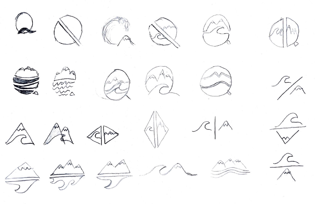
STEP 1 —SKETCHING
Experimenting with different emblems, abstract symbols, & pictorial marks.
STEP 2 — IDEATION
Narrowing down the three strongest possible directions to explore final logo.

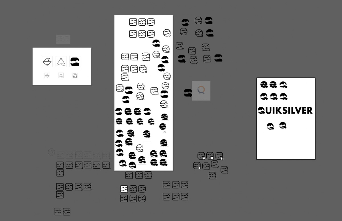
STEP 3 — FINALIZE
Finalizing logo to be functional for all deliverables within project goals.
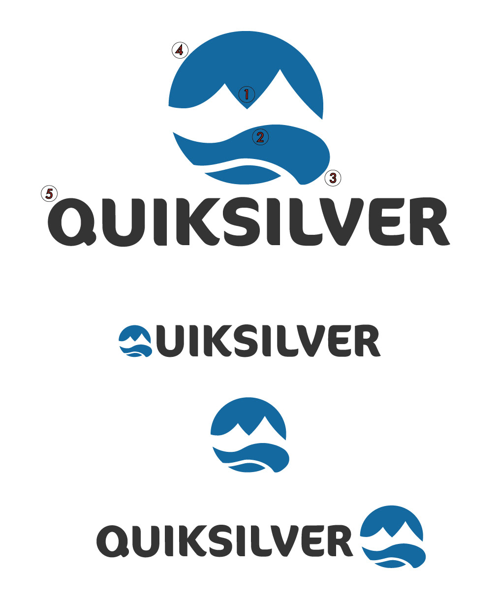
FINAL LOGO
1 — Mountains
The mountains represent the snowboarding and skiing product line that Quiksilver is expanding towards.
2 — Wave
The wave pays homage to their old wave logo while maintaining the recognition for their current surfing product line.
3 — Q
The pictorial mark itself creates the shape of a ‘Q’ that can also be used within the typeface.
4 — Color
The warmth of the blue represents calmness and peacefulness. The balance of blue and white showcases the color of the ocean, snowy mountains, and the sky.
5 — Typeface
ConconPro Bold displays organic flow and heaviness as an extension of what the rebrand of Quiksilver visually represents.
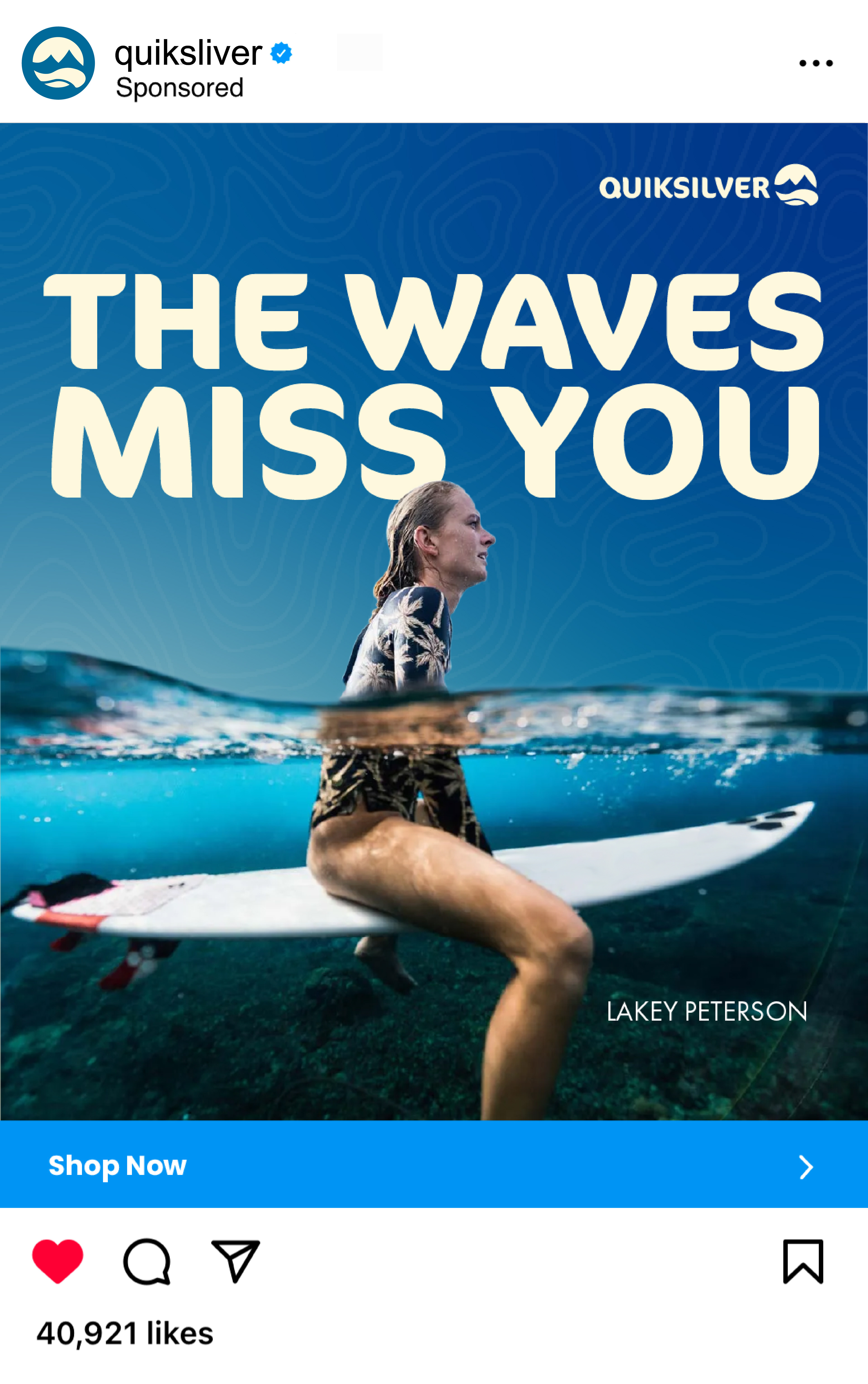
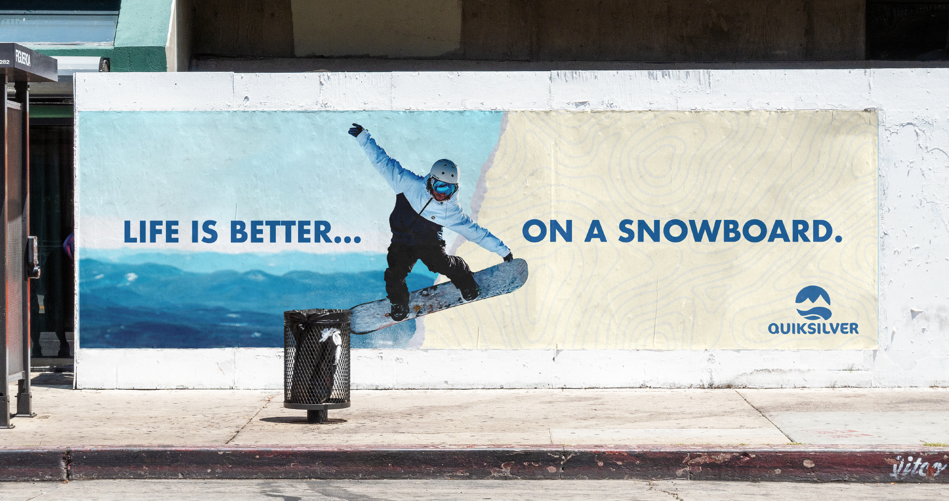
FINAL QIKSILVER REBRAND DELIVERABLES
FINAL LOOK AND FEEL OF THE BRAND
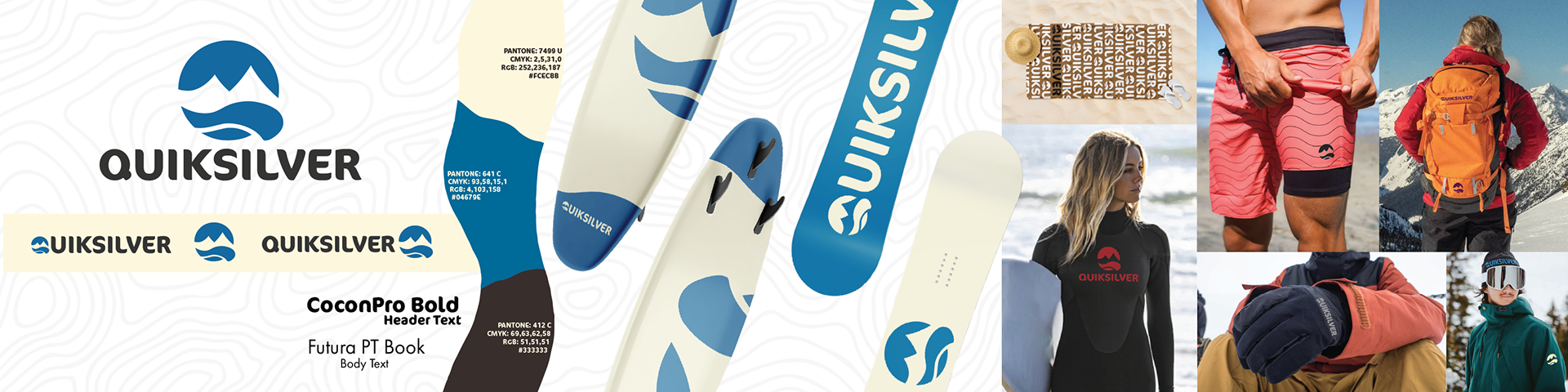


OVERVIEW
Researching the pain points of this brand made it simple to know what directions to take when attacking the problem. being able to rebrand gave me the creative freedom to explore what Quiksilver could look like on merchandise and advertising platforms.